Figure 3-3Sample Robustness Heatmap for WY Minimum Combined Storage of Lake Powell and Lake MeadPercent of futures in which the WY minimum combined storage stays above the historical minimum (12.77 maf) in the percent of years specified by each row
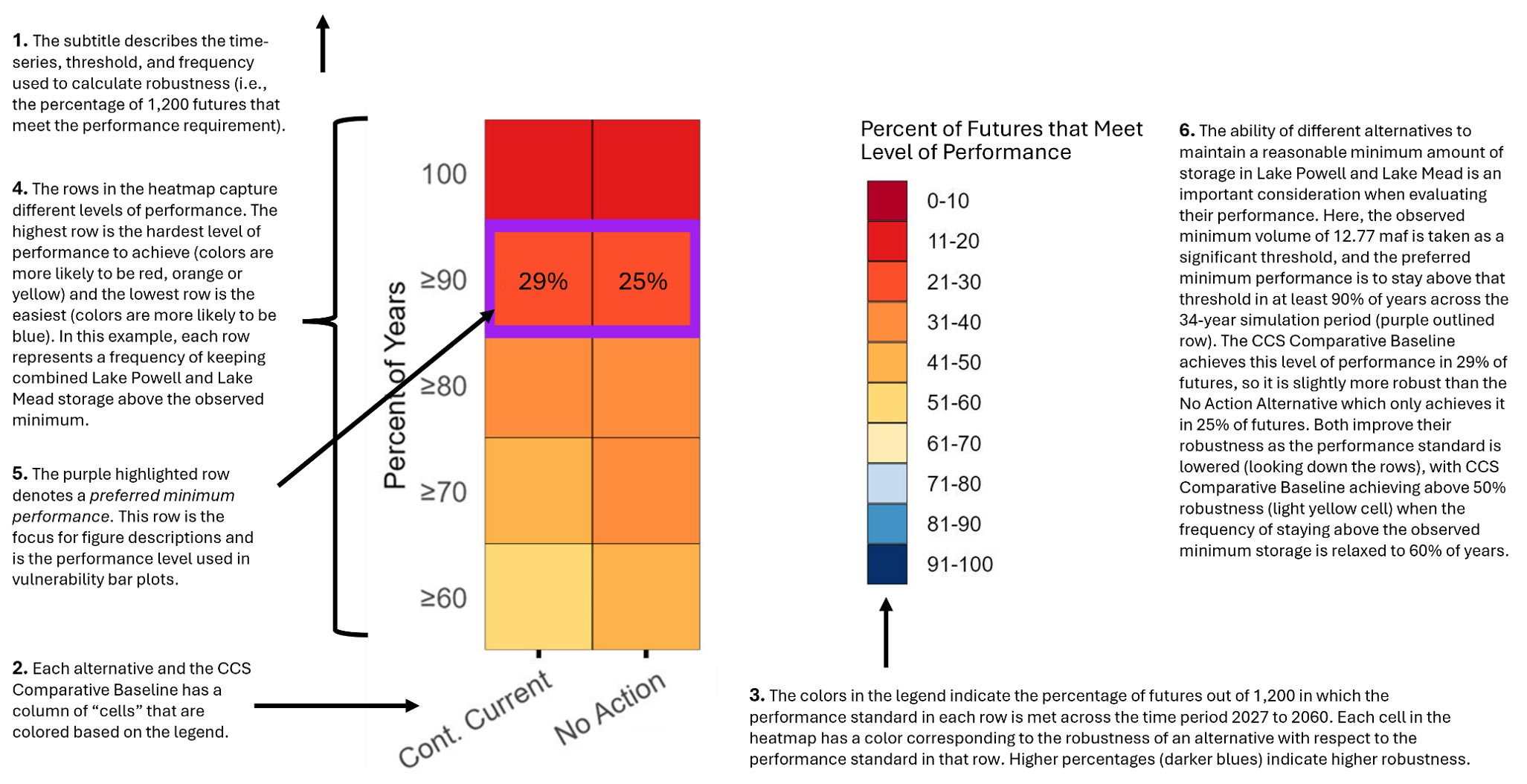
A robust alternative is one that achieves a preferred level of performance under a wide range of future conditions. Robustness heatmaps show the alternatives’ ability to meet different levels of performance over one or more decades in the wide range of potential future conditions used in the analysis. Since there are many ways to analyze performance for each resource, there are many opportunities to define meaningful levels of performance. A definition for a single level of performance requires three components: the modeled outcome of a system variable over a time period (i.e., a timeseries), a threshold, and a frequency of meeting the threshold over the specified period.
When a simulated (or modeled) future meets the specified level of performance, it is considered a “successful future.” Under each alternative, the percentage of futures (out of 1,200 modeled futures) that are successful provide information about how robust the alternative is. A large percentage of successful futures (i.e., a high robustness score) means that the alternative is robust (i.e., it performs well) with respect to the specified level of performance; a low percentage of successful futures means that the alternative is not robust with respect to the specified level of performance.
The data that was sorted into categories for the conditional boxplots in Figure 3-2 can be used in an example robustness heatmap. Performance levels are defined using the annual timeseries of minimum WY combined storage in Lake Powell and Lake Mead (i.e., the minimum storage recorded in each WY from 2027 through 2060) and comparing the timeseries to the threshold of the minimum observed storage (12.77 maf), where staying above this value is better. The final component of defining a level of performance is the frequency of staying above the minimum observed combined storage (100 percent of years, 90 percent of years, etc.).
Figure 3-3 compares the robustness of the No Action Alternative to the CCS Comparative Baseline with respect to their ability to maintain different levels of performance in combined Lake Powell and Lake Mead storage. It is annotated using numbered descriptions as a guide to the features of the figure and a summary of findings. Reading the text in numerical order will provide the clearest understanding.
An important feature of Figure 3-3 is that each row represents a different level of performance. This is useful because individuals can have different opinions about what level of performance is necessary for a given resource. In this case, they could focus on the row that best aligns with their preference. At the same time, it is useful for resource experts to identify a ‘preferred minimum level of performance,’ which is identified in Figure 3-3 by the purple box. In this example, the preferred minimum performance level is for the combined storage of Lake Powell and Lake Mead to stay above 12.77 maf in at least 90 percent of years. The preferred minimum performance level is also the basis for vulnerability analysis, as described in the next section.
Interpret robustness heatmaps: Every column of colors represents the robustness of an alternative across different levels of performance in a given resource. The more blue there is in a column, and the darker the blue, the more robust an alternative is; a large amount of orange or red, and especially dark red, means an alternative is not robust with respect to a specific type of performance.
This type of figure is referred to as a “heatmap” because clusters of colors provide an easy way to identify regions of robustness or lack of robustness across the alternatives. Robustness heatmaps contain a large amount of information, but even a brief visual inspection can provide the key conclusions about robustness.Key visual tips to quickly interpret robustness heatmaps: Every column of colors represents the robustness of an alternative across different levels of performance in a given resource. The more blue there is in a column, and the darker the blue, the more robust an alternative is; a large amount of orange or red, and especially dark red, means an alternative is not robust with respect to a specific type of performance.